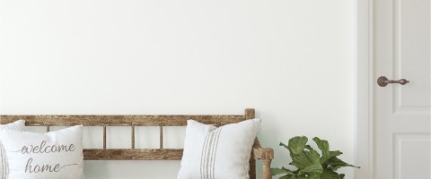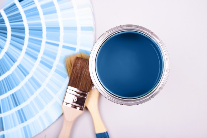
TOP PAINT COLOR INSPIRED BY TV
Color inspiration comes from everywhere and why not from our favorite TV shows? We have noticed a lot of great design projects and color palettes inspired by pop culture and television lately. We thought we would break down a list of some of our favorites from the past year as well as some throwbacks!
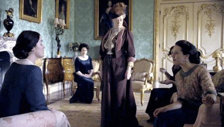
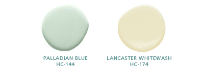
1. Downton Abbey Benjamin Moore's Sonu Mathews blogs about this TV show's Edwardian era color here. We especially enjoy Palladian Blue, HC-144, as suggested inspiration from this drawing room with beautiful pale, greenish aqua wallpaper .
2. Good Wife Actually...this is inspiration from Good Wife actress Julianna Margulies. This year, Architectural Digest featured Margulies' family-friendly Manhattan home transformed by designer Vincente Wolf. Wolf recently partnered with PPG Pittsburgh Paints on a special color palette called the Color Diaries home collection. It is a reflection of inspirations from his travels around the world. Marguilies' apartment uses PPG Vincente Wolf White, PPG1001-1 (also know as PPG Delicate White, 518-1). Check out Wolf's collection and the Color Diaries brochure at most Spectrum locations! 
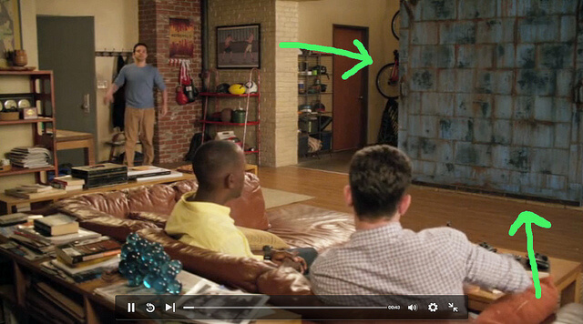
3. New Girl Let's just say it: New Girl is the new Friends. Designer Kara Paslay liked the sliding door featured in the New Girls loft so much that she created her own version for her own downtown loft! This door also happens to be one our most popular pins on Pinterest. You can check out the full tutorial on how Kara made this door come to life using Modern Masters here or by clicking the pic below!
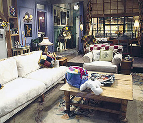
4. Friends Speaking of Friends...even though the show has been over for 10 years (TEN- that can't be right?!), you can't turn on your television without an episode being available on at least one channel. Do you remember the color of Rachel and Monica's (and at different times, many of the character's) apartment? It was purple! If you're feeling bold you can try out Benjamin Moore's Seduction (1399) - maybe an accent wall or a piece of furniture?
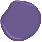
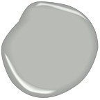
Benjamin Moore Seduction, 1399
5. Mad Men Mad Men is set in 1960s NYC and highlights the business of advertising agencies during that time period. Benjamin Moore Color Chat's Jane Dagmi interviews 3 masters of visual merchandising about some of the sets and color schemes. Read the interviews and see the color palettes here! The Sterling Cooper Draper Pryce office below features orange and neutrals that would just as easily look great with modern furniture in design today. Our friends at Double Eagle Design also write about Mad Men and some of the trends that current contemporary style pulls from that time period. As quoted in their blog: "Everything old is new again!"
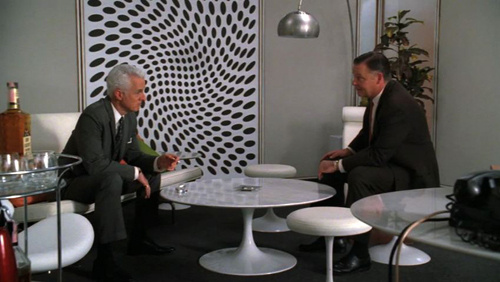
Benjamin Moore Coventry Gray, HC-169 _________________________________________________________
Shop Online Here for in-store pick-up, curbside pick-up or delivery within 5 miles of your neighborhood Spectrum Paint location.