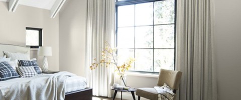
In this post, we will explore warm versus cool neutrals and how they can differ based on how you are viewing them. The color shown online can vary from screen to screen and show up differently based on light and device settings. We always recommend trying a sample on a board and moving it throughout the room at varying times of day to best capture different lighting throughout the day. Check out this video on our recommendations for color sampling:
When it comes to choosing a warm or a cool paint color for your space, a cool color has more of blue or green undertone, while a warm color has more of a yellow, red, or brown undertone. If your home has a lot of warm colors in the docor, the cool paint color will become a lot more blue and “icy” feeling. Conversely, a home with cooler-toned decor with a warm paint color on the walls could turn the color very taupe or red. Our pro tip for checking the undertones of a neutral? Take the color chip 1600 and place neutral colors against it. You can really see the cool or warm tones come out.
We have rounded out some popular Benjamin Moore neutral paint colors, denoting whether they are warm or cool, and show them online, as a paint chip, and painted with two coats on a color board. Read on to choose your favorite warm or cool neutral!
Cool
Amherst Gray HC-167
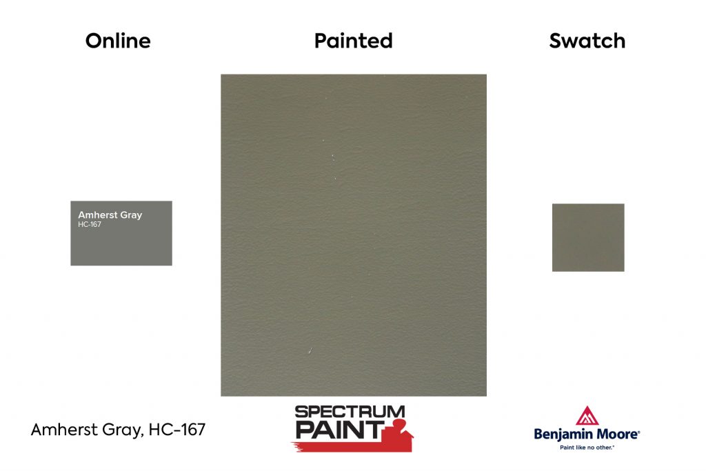
Amherst is a deep gray with hues of green and yellow. It's a popular choice for home exteriors or on a front door in contrast to a crisp, white trim.
Coventry Gray HC-169
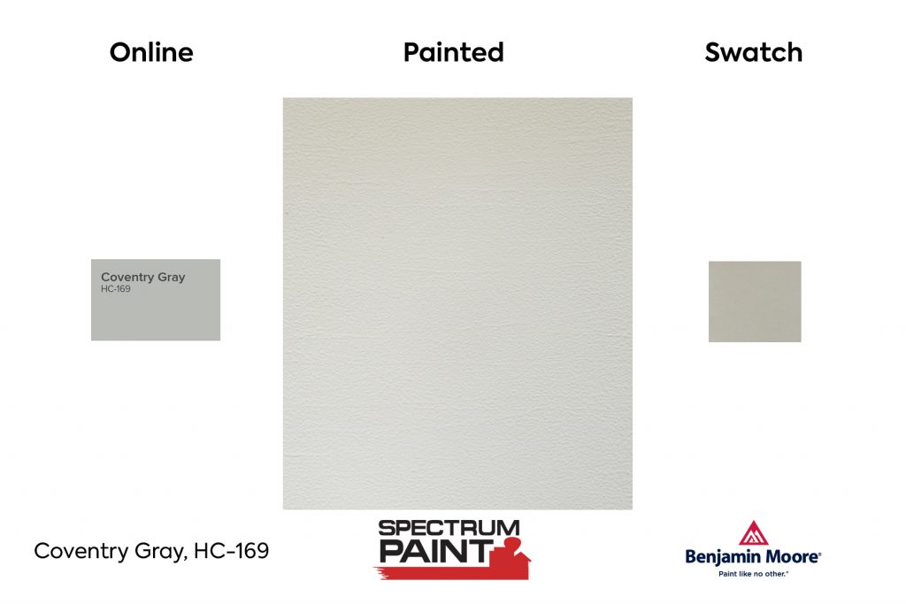
Gray with a slight blue undertone (if you are looking for a "grayer gray", may try Thunder AF-685) and part of the Historic Color Collection, 191 time-honored hues that can be used in traditional as well as contemporary spaces.
Eternity AF-695
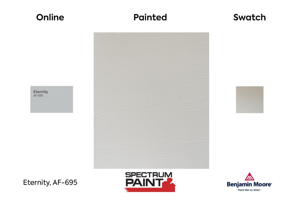
A darker gray, Eternity is cool, classic, and timeless. It's part of the Affinity Collection, a group of well thought out colors that work seamlessly with one another.
Stonington Gray HC-170
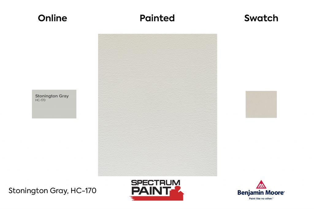
Stonington Gray is a light, modern gray that works well in a variety of spaces, from sitting room walls to kitchen cabinets. Stonington Gray is regularly revered as a Benjamin Moore Best Gray paint color.
Wickham Gray HC-171
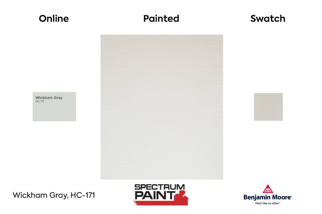
Benjamin Moore's Wickham Gray is a pale gray that changes with the light and seasons. We used it in a house in Chatham and against a pale green, pale greenish blue and it was incredible how it played off of those colors. Wickham Gray changes with the light; it can go from warm to cool." - South Coast Today
Shoreline 1471
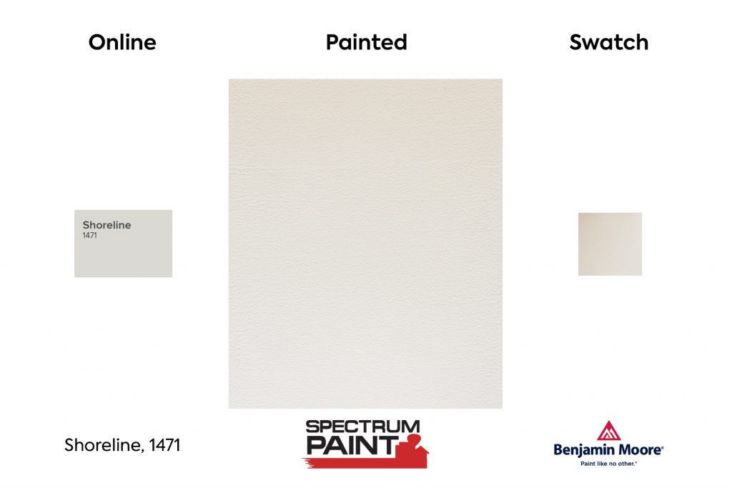
" My go-to neutral shade is Shoreline. I searched high and low for a pale gray that would not read blue, green, or lavender, and this color has just enough pigment to contrast well against crisp, white trim, but not so much that you can't use it everywhere - even on the ceiling!" says Claire Paquin of Clean Design.
Neutral
We will include one neutral - Gray Owl. Gray Owl can be both cool or warm, depending on how it is accented. If there are blues, purples, and grays it can appear more cool. If the room is furnished with red, yellow, or brown the color can appear warmer.
Gray Owl OC-52
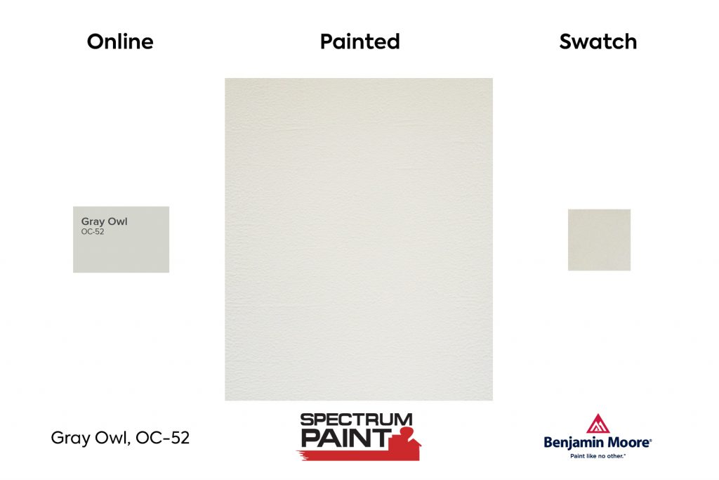
Gray Owl is an all-out unadorned, approachable color that pairs beautifully with stainless steel appliances in a modern kitchen.
Warm
Classic Gray 1548
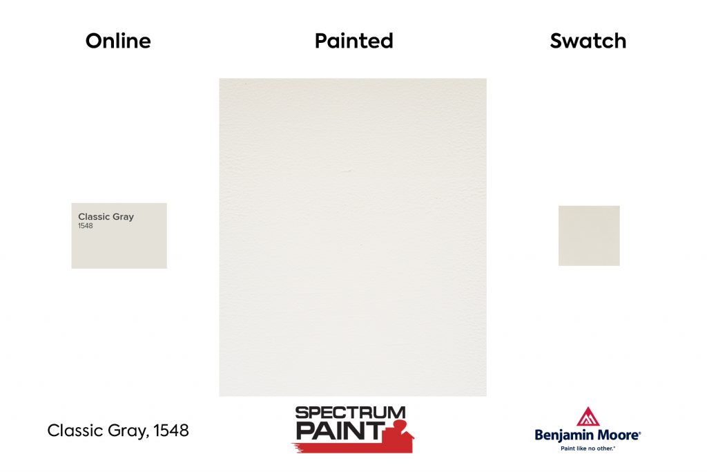
"Classic Gray is just a whisper of gray. Just enough gray to give some contrast against white trim, giving a hint of color and warmth." - Evolutions of Style Blog
Pale Oak OC-20
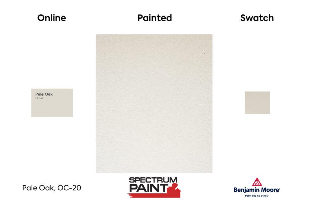
Reminiscent of the majestic white oak, this beautiful neutral is graceful and elegant, conveying a sense of style and quiet restraint.
Balboa Mist 1549
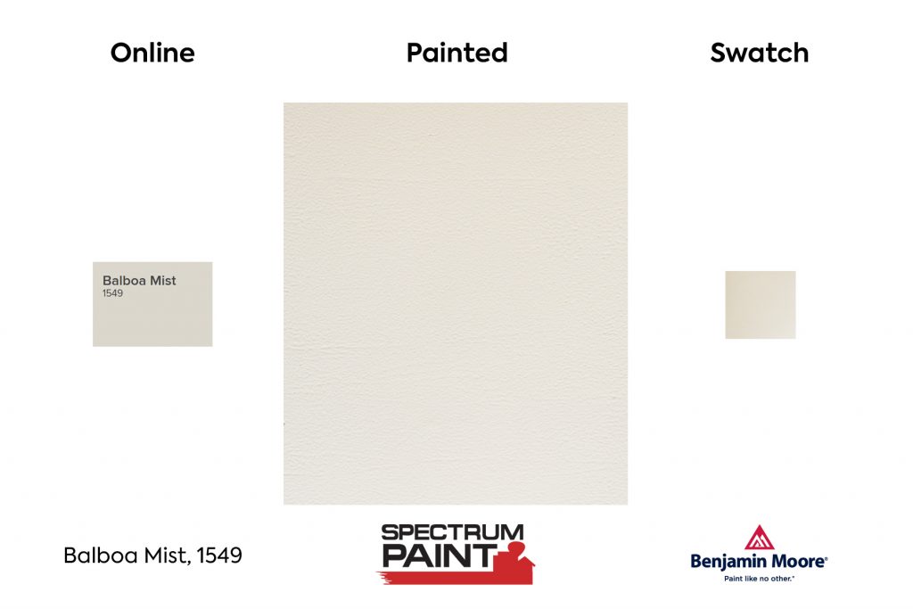
"This Benjamin Moore paint color, straight from the Off-White Color Collection brings tranquil tones of white and serves as a beautifully neutral backdrop." - Architectural Digest
Edgecomb Gray HC-173
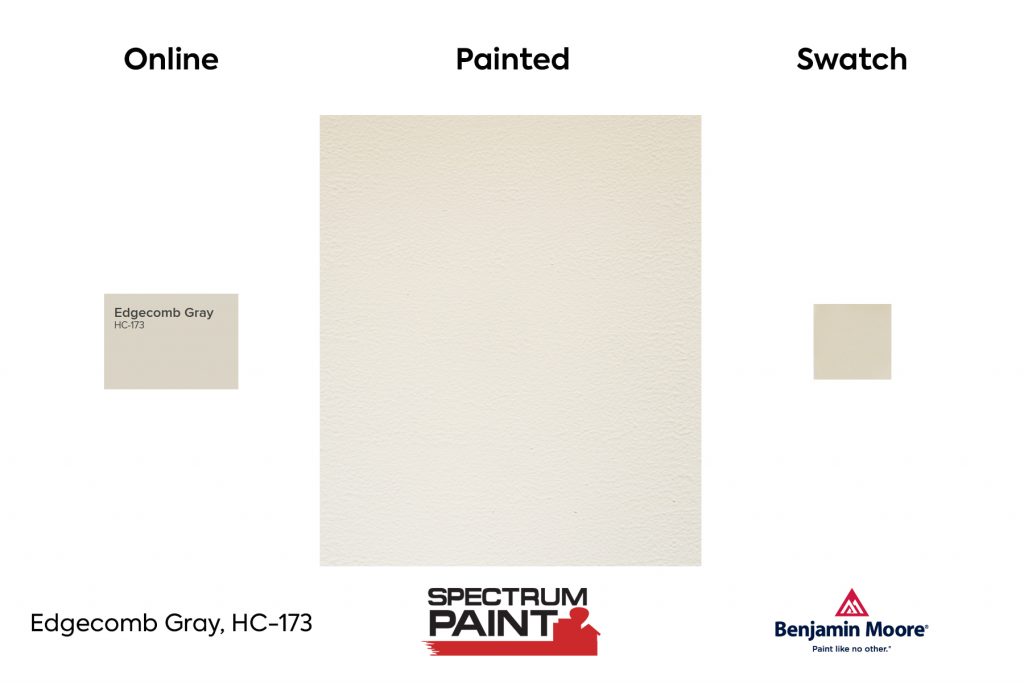
A go-to gray that's timeless with a modern edge, this earthy, organic neutral is soft and stylish, creating a setting that feels distinctly personal.
Revere Pewter HC-172
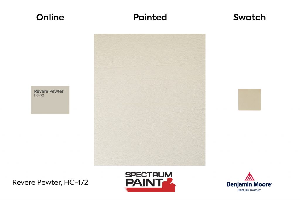
A light gray with warm undertones, this classic shade creates a unifying look that calms and restores. A great transitional color, it's perfect for an open floor plan.
Pashmina AF-100
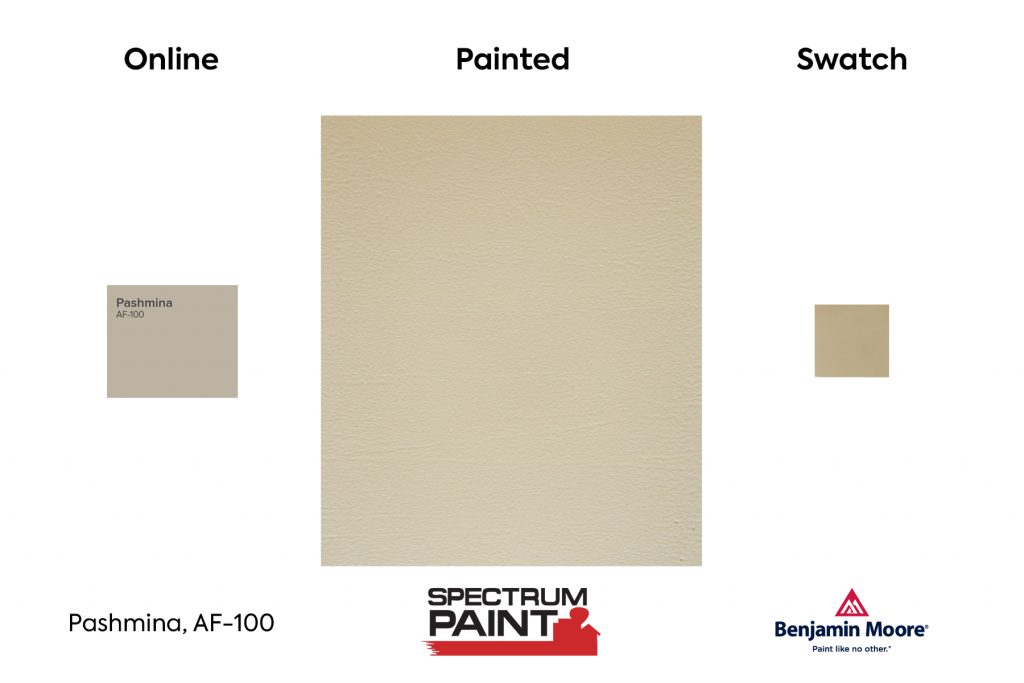
"It's a muddy colour with a green undertone and has slightly more intensity & depth than the popular 'Revere Pewter'. It's one of those rare colours that often works well with both the beiges and the grays," says designer Claire Jefford.
Which of these best gray paint colors is your favorite? Do you prefer cool or warm gray?
Shop Online Here for in-store pick-up, curbside pick-up or delivery within 5 miles of your neighborhood Spectrum Paint location.